Today, I would like to introduce how to use the package ggridges to create a ridgeline density plot. Let’s start.
Install the package
install.packages("ggridges")First try
library(ggplot2)
library(ggridges)
library(dplyr)
##
## Attaching package: 'dplyr'## The following objects are masked from 'package:stats':
##
## filter, lag## The following objects are masked from 'package:base':
##
## intersect, setdiff, setequal, unionplt<-ggplot(iris, aes(x=Sepal.Width, y=Species, fill=Species))
plt<-plt+theme_bw()
plt+geom_density_ridges()## Picking joint bandwidth of 0.13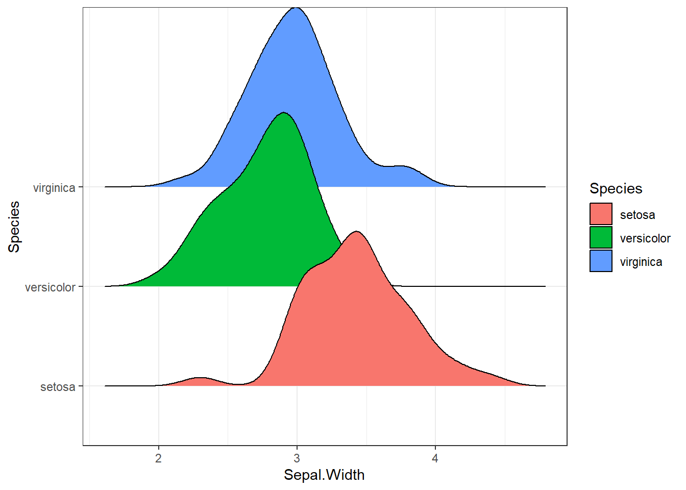
Looks good, right.
Add data points
To do so, we will add rug lines at the bottom of each distribution, by
turn on the option jittered_points.
plt<-plt+geom_density_ridges( # add rug points
    jittered_points = TRUE,
    position = position_points_jitter(width = 0.05, height = 0.01, yoffset = -0.1),
    point_shape = '|', point_size = 2, point_alpha = 0.8, alpha = 0.7, point_color="blue")
plt
## Picking joint bandwidth of 0.13
Parameter explanation:
position_points_jitter() is used to determine where the rug lines are, here
widthandheightgives the range for the lines to move randomly, and yoffset tells to move all lines downwards a certain amount.point_shape, point_size, point_alpha, point_color all determine the appearance of the rug lines.
Add the number of data points for each distribution
Get counts
pointCnt<-iris %>% group_by(Species) %>% count()Update the plot with geom_text() to add counts.
plt+geom_text(data=pointCnt, aes(x=4.5, y=Species, label=n))## Picking joint bandwidth of 0.13
Let’s move the count number a bit to the top
plt<-plt+geom_text(data=pointCnt, aes(x=4.5, y=Species, label=n),
  nudge_y = 0.95, vjust=1, size=7/.pt, color="red")
plt
## Picking joint bandwidth of 0.13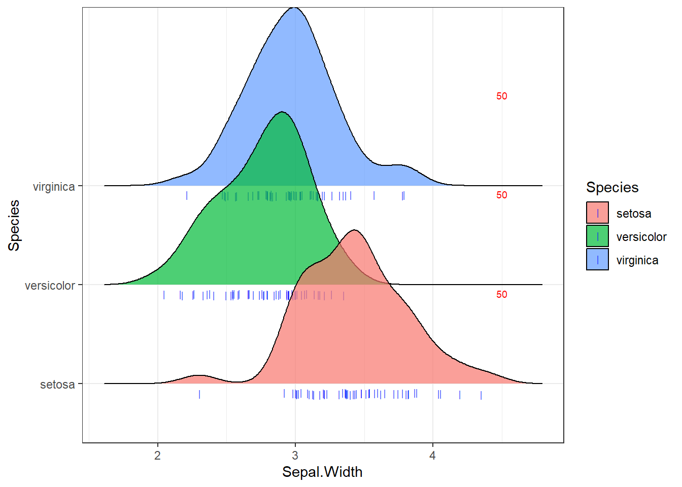
Here we use the parameter nudge_y to shift the y value upwards
a certain amount and set text size and color.
It looks good, isn’t it?
References
One can find more examples of how to tune the ridgeline density plot at the following pages:
Happy programming 😄 !
Last modified on 2023-07-01