library(ggplot2)
library(dplyr)
Sometimes you may want to create a plot with the following features:
- a point to indicate the mean of a group
- error bars to indicate the standard deviation of the group
- and each group may have subgroups, which are represented by different colors.
In this post, I will show you how to create such a plot using the ggplot2 package in R.
We will use the builtin mtcars dataset as an example. And we need to
compute the following variables for later use:
- The mean mpg for each group of
cyl(number of cylinders) andgear`` (number of gears), herecylis the main group andgear` is the subgroup.
# Load the mtcars dataset
data(mtcars)
# Compute the mean and standard deviation of mpg for each group
mtcars_summary <- mtcars %>%
  group_by(cyl, gear) %>%
  summarise(mean_mpg = mean(mpg), sd_mpg = sd(mpg)) %>%
  ungroup()
# replace the NA values in sd_mpg with 1
mtcars_summary$sd_mpg[is.na(mtcars_summary$sd_mpg)] <- 1
# convert group variables into factors
mtcars_summary$cyl <- factor(mtcars_summary$cyl)
mtcars_summary$gear <- factor(mtcars_summary$gear)
Create the plot - first try
Now we can create the plot using ggplot2. We will use the geom_point() function to create the points, and the geom_errorbar() function to create the error bars. We will also use the aes() function to specify the aesthetics of the plot.
# Create the plot
plt <- ggplot(mtcars_summary, aes(x = cyl, y = mean_mpg, color = gear)) +
  geom_point(size = 3) + # add points
  geom_errorbar(aes(ymin = mean_mpg - sd_mpg, ymax = mean_mpg + sd_mpg), width = 0.2) + # add error bars
  labs(x = "Number of Cylinders", y = "Mean MPG", color = "Number of Gears") + # add labels
  theme_minimal() + # use a minimal theme
  theme(legend.position = "top") # move the legend to the top
plt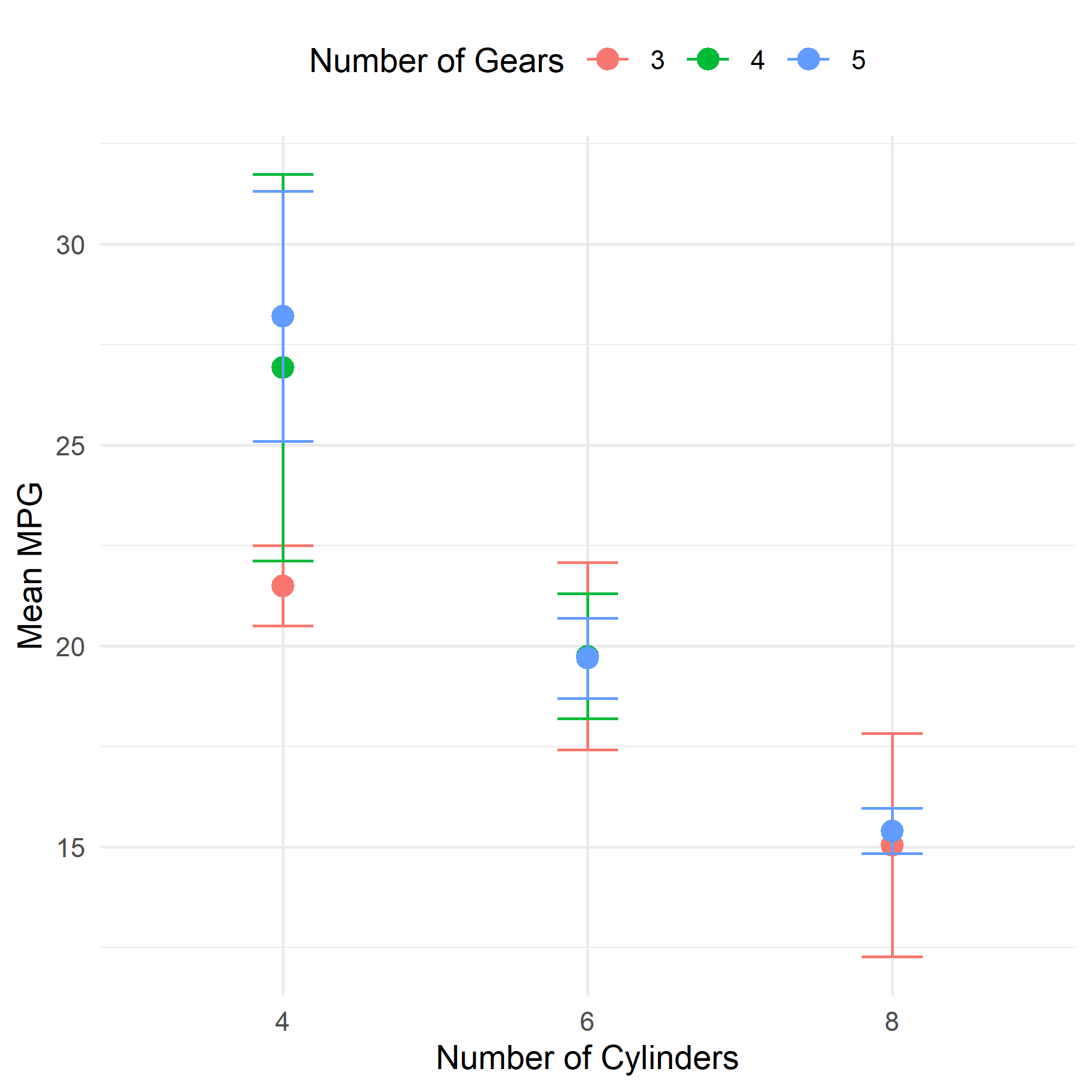
Well, it is working, but the problem is that the error bars and points are all aligned at the same position of x-axis. This is not what we want. We want the subgroups to be separated by a small distance.
Create the plot - second try
To separate the subgroups, we can use the position_dodge() function. This function will move the points and error bars to the left and right, so that they are not overlapping.
pd <- position_dodge(width = 0.5)
# Create the plot with position_dodge
plt <- ggplot(mtcars_summary, aes(x = cyl, y = mean_mpg, color = gear)) +
  geom_point(size = 3, position = pd) + # add points with position_dodge
  geom_errorbar(aes(ymin = mean_mpg - sd_mpg, ymax = mean_mpg + sd_mpg), width = 0.2, position = pd) + # add error bars with position_dodge
  labs(x = "Number of Cylinders", y = "Mean MPG", color = "Number of Gears") + # add labels
  theme_minimal() + # use a minimal theme
  theme(legend.position = "top") # move the legend to the top
plt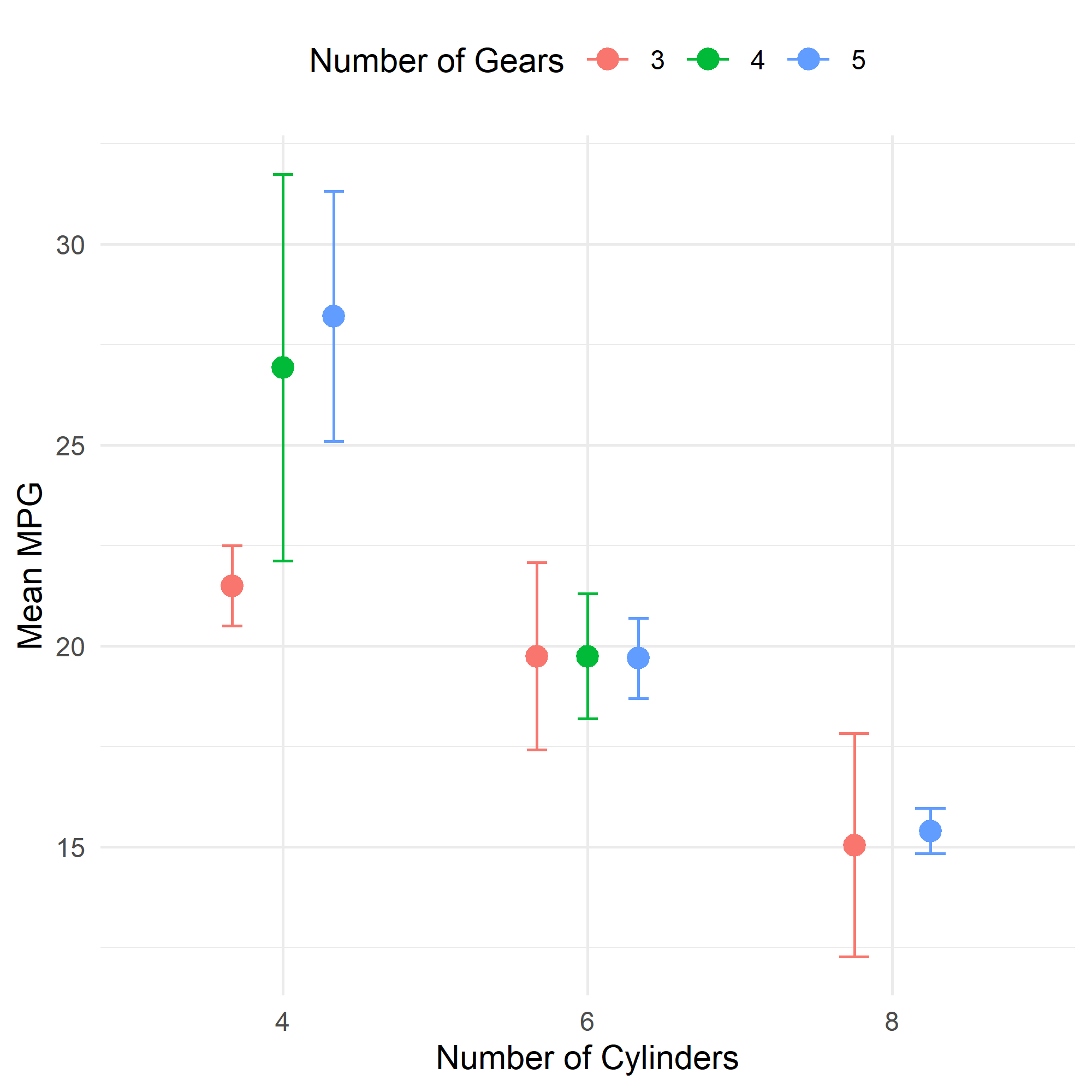
Cool. Isn’t it?
The only difference is that we added the position = pd argument to the geom_point() and geom_errorbar() functions. This tells ggplot2 to use the position_dodge() function to separate the subgroups.
Conclusion
In this post, we learned how to create a plot with error bars and overlaid points using the ggplot2 package in R. We also learned how to separate the subgroups using the position_dodge() function.
If you want to learn more about the function position_dodge(), you can check an
excellent post here.
Happy programming! 😃
Last modified on 2025-04-26